Rapid7 Design Library
| Project Overview |
In a huge effort to create consistency, and get designers and developers on the same page - The Rapid7 system needed to be reimagined from the ground up in Figma.
Tools used
Figma
Illustrator
After Effects
Migrating from Adobe XD
Our team primarily worked in Adobe XD and Photoshop to create web UI.
Designs were being created in inconsistent ways. Even the base building blocks of the website were not being used the same way between designers.
At best this resulted in designs not accurately matching what was developed. At worst, it was forcing developers to create multiple varieties of every component, and leading to an incohesive/broken experience.
After extensive talks, we decided migrating to Figma was going to be a great path forward.
Website + Security Suite = Marriage
While my primary responsibility for the company was on the website, we did also aspire for our software and marketing to start to display a consistent brand as well.
We identified that the icons could be an ideal first win towards making that happen. The icon library being used in the Rapid7 Insight suite of products was entirely unique from our marketing icons. It was also full of inconsistency in design, duplicates, and poor organization resulting in misuse.
With a fine tooth comb, I identified all of the design inconsistencies to create a set of rules to apply to the icons. Keeping them as similar as possible to avoid breaking anything in the software, but making them visually consistent.
Next, I went through removing duplicates and renaming each icon to describe the icon itself, rather than the product it was attached to. I also created multiple potential tags for each icon.
It was crucial to map exactly every name change and removed/consolidated icon. When it was time for development to get a hold of this new icon set, the icons would have to map perfectly back to their original mappings in the software or it would break.
The rollout to the software was a success, and I then was able to batch export SVG, PNG, and JPG versions of each icon to an internal company page where we made the library easily searchable so members of the organization could copy and paste our icons to their presentations or download the native files.
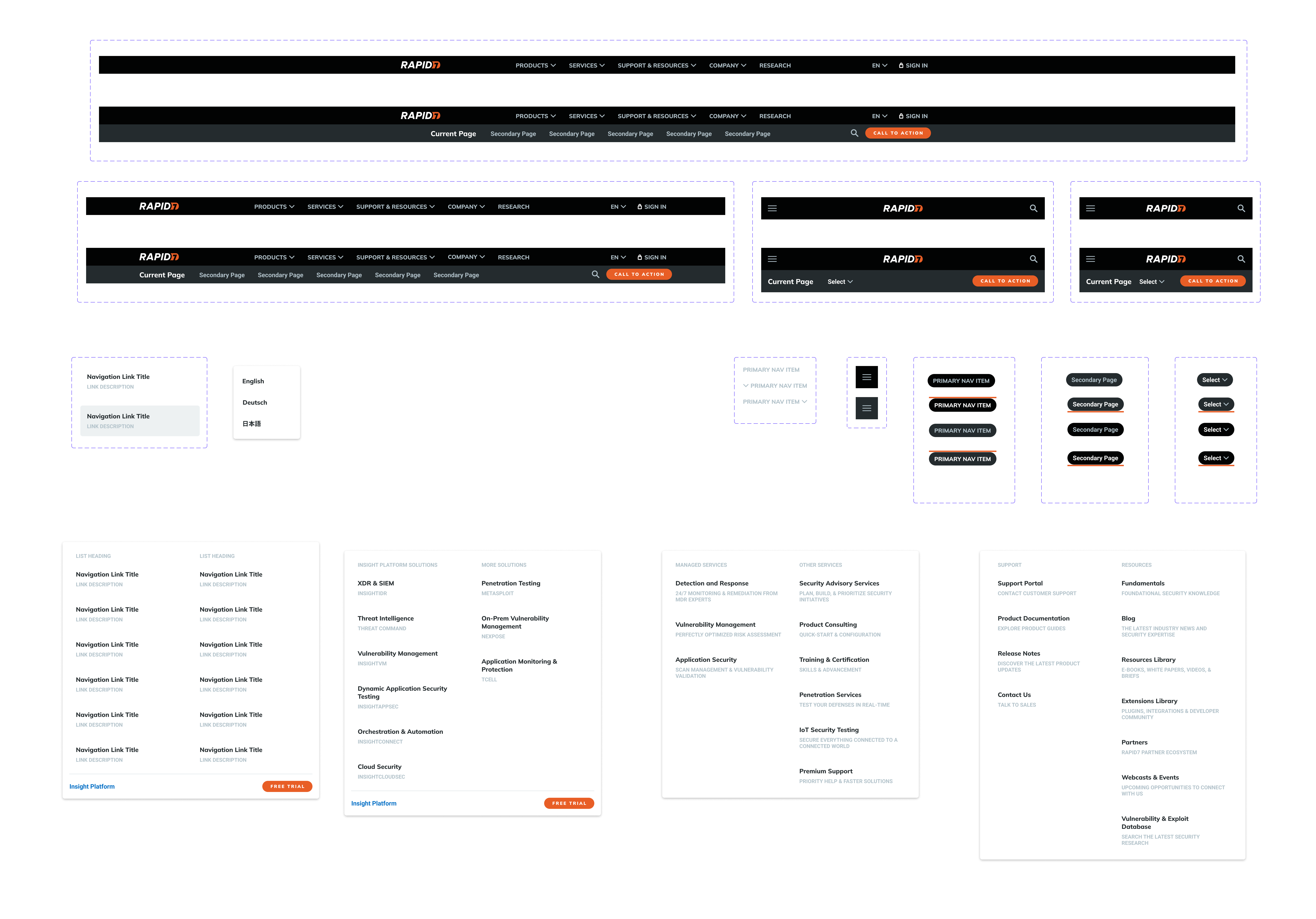
The building blocks
Meanwhile I was also working on creating the base of the library so our designers could start transitioning to creating their designs in Figma.
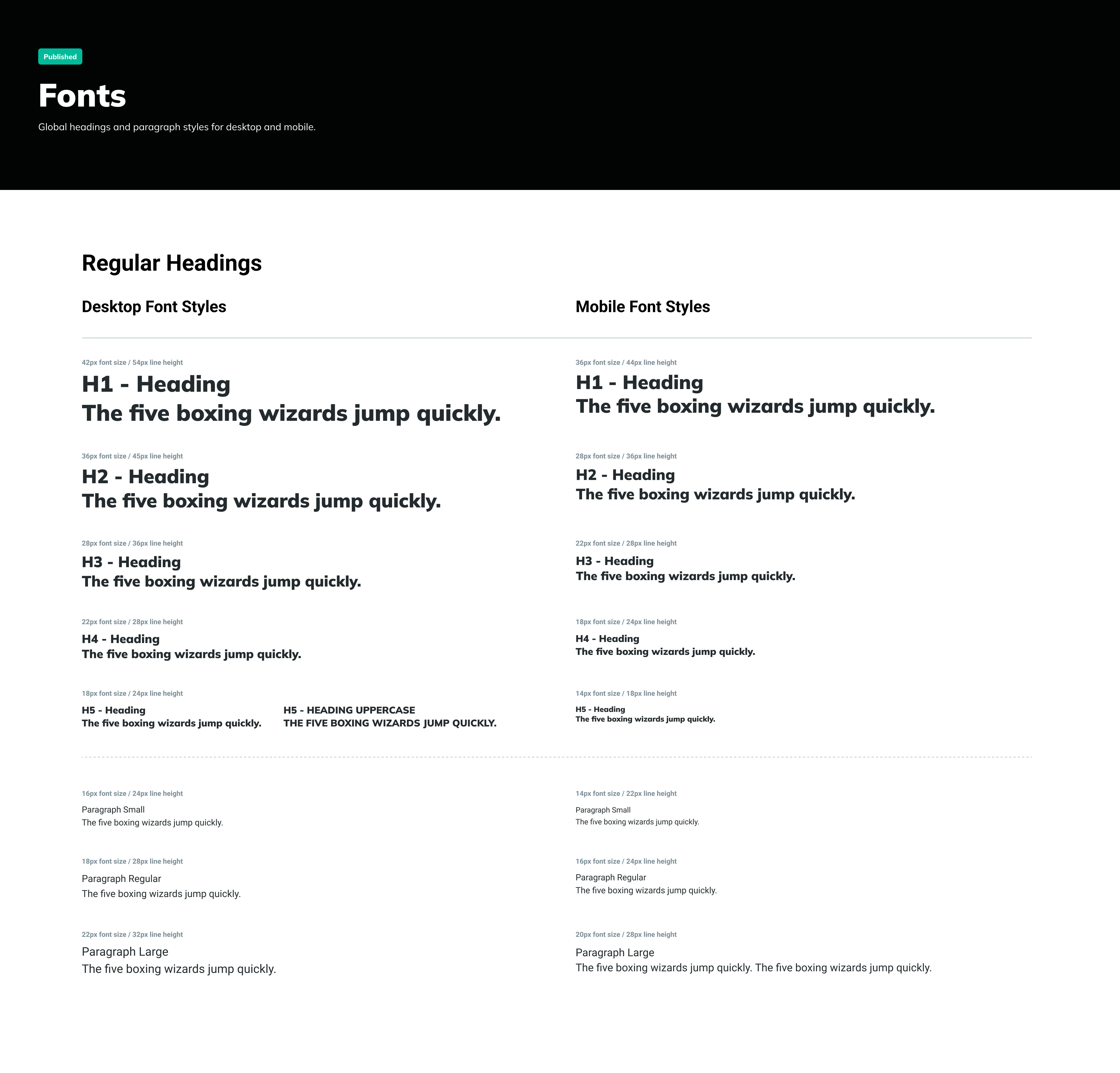
I recreated our color library, fonts, cards, and everything that we could document. I also worked on creating functional and responsive prototypes for some our components such as the navigation.
I took care to consolidate where required, making executive decisions on some components, and regrouping with the team to make sure we stayed in alignment for decisions that required more nuance.
The general goal was to not change the design. It was to get the library in place so we would be in a successful position to complete a rebrand when the time came.
Library Rollout
We had enough components and styles built out to launch the library so that the rest of the team could begin creating their own designs in the library.
Each designer was now grabbing their components from the same spot which had an immediate impact on design consistency.
We also created a universal thumbnail for each of the projects so that it would be easy for designers to link to their JIRA tickets, as well as identify any stakeholders related to the project. Every team member was easily selectable from a dropdown, which further has helped to go back into projects previously completed and identify who might have knowledge of the project for aid with future updates.