Toy Instruction sets
| Project Overview |
At Hasbro I created instruction sheets for over 100 products for Transformers, and Marvel toys.
Each instruction sheet required extensive testing of the products. Determining how the product works in coordination with the engineers, and negotiating for budget to be able to adequately fit the transformation of the toy on the instruction sheet.
I also tested each product step-by-step and photographed how the model in each position to ensure an accurate transformation depiction. I would use the images to request matching renders for the toy in the positions documented. Finally I would design the instruction sheets using branded elements for the toy series.
Tools used
InDesign
Illustrator
Photoshop
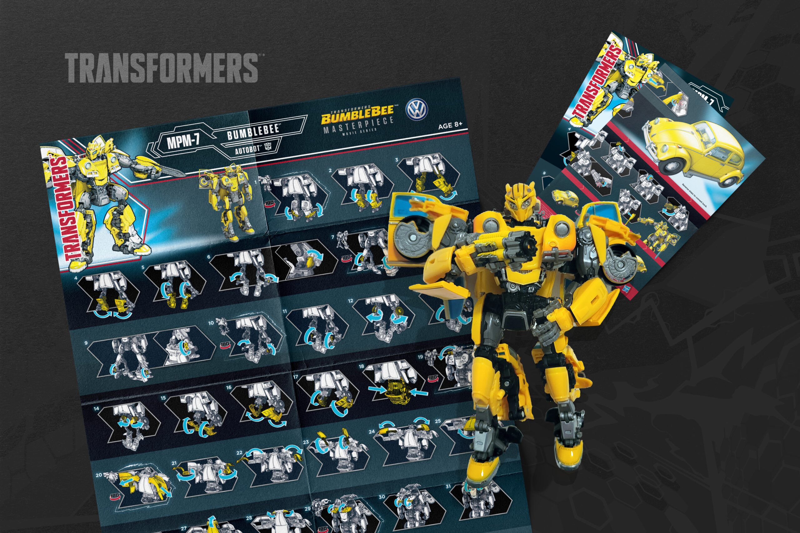
Transformers Masterpiece

The Masterpiece series is the premier line of Transformers. Aimed at adult collectors these models comes with additional challenge in designing the instruction sheet.
The models themselves are highly complex, and there is not budget available to create a full instruction booklet for this product. This results in having to fit roughly 100 intricate transformation steps onto 1 sheet of paper front & back.
We have received consistent feedback about difficulties for consumers to use the instructions in the past, and as someone who had to go through the steps for every product myself, I agreed.
The question became, what steps can I take to improve the overall transformation experience for these "Masterpiece" models.
I went for a 3 step approach towards improving key areas.
Step 1
It was difficult to see the highlighted focus piece in a step, because the renders were in full color. But just because this instruction sheet could use full color, doesn't mean that it should.
I had the renders exported in black and white line-work, which made the yellow highlighted focus greatly improve contrast from where it had been.
Step 2
The renders were too small. No matter how well the highlight popped, it was impossible to make out the detail of exactly which part you need to focus on for the transformation.
To combat this, I scaled up the renders, and cropped out the areas that weren't being focused on. This allowed me to maximize the render size, and it would be okay that you couldn't see the entire render at one time, because of factor number 3:
Step 3
With the render steps scaled up to maximum size, I incorporated showing a tiny full scale render to help orient the user of what direction and location on the model they should be looking for.
The result was a product that still very much could benefit from having a full booklet of transformations dedicated to it. But an instruction sheet that is exciting and at least a little bit easier to understand nonetheless.
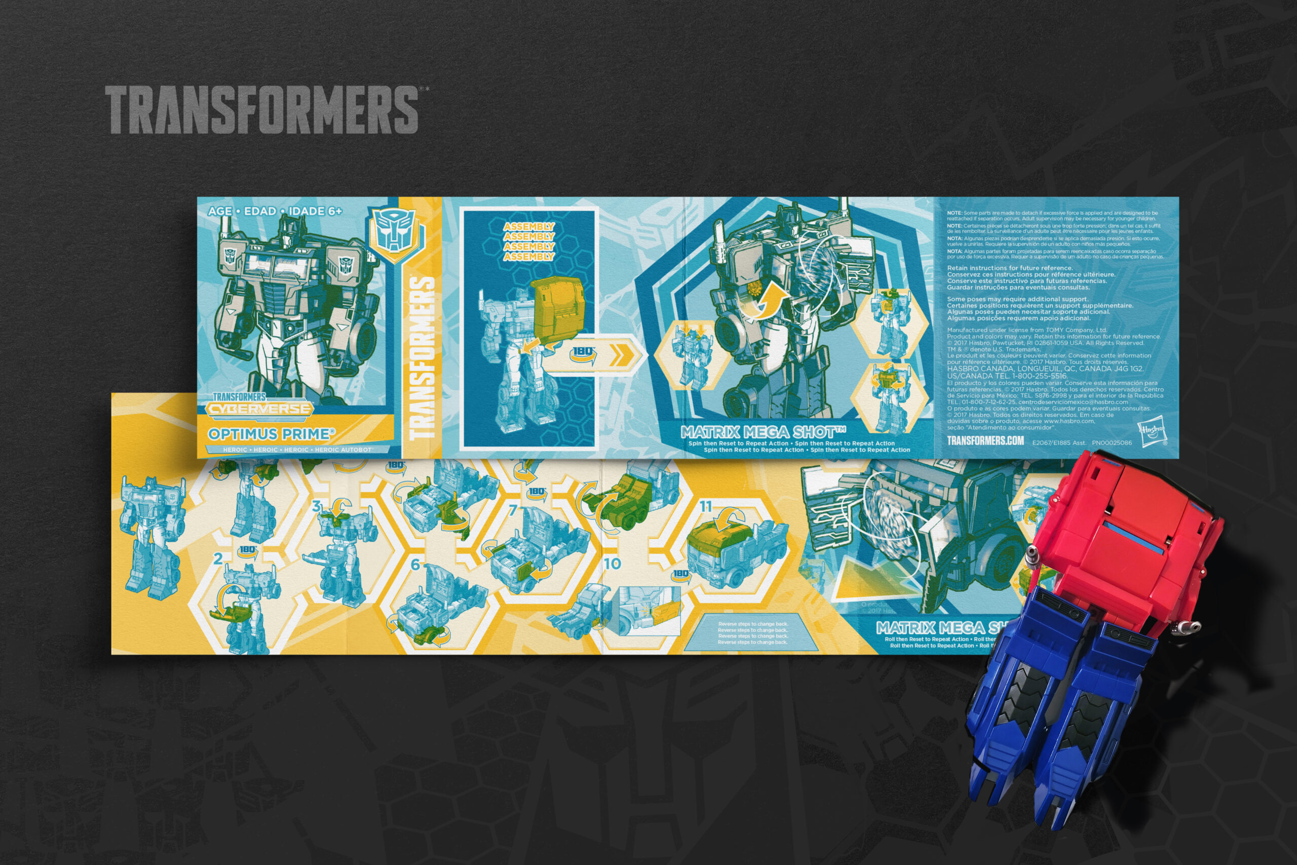
Action Attackers

The Action Attackers lineup. These are some of the simplest transformers made for young children. I developed the visual language for this line to be fun and clear. For the first time using the 2 color limitation of these instructions and combining the colors to create a more varied palette.
Each of these products featured an action that could be triggered - which in the instructions resulted in a fun illustration to display the move, along with a custom composited render for more color packed coolness.
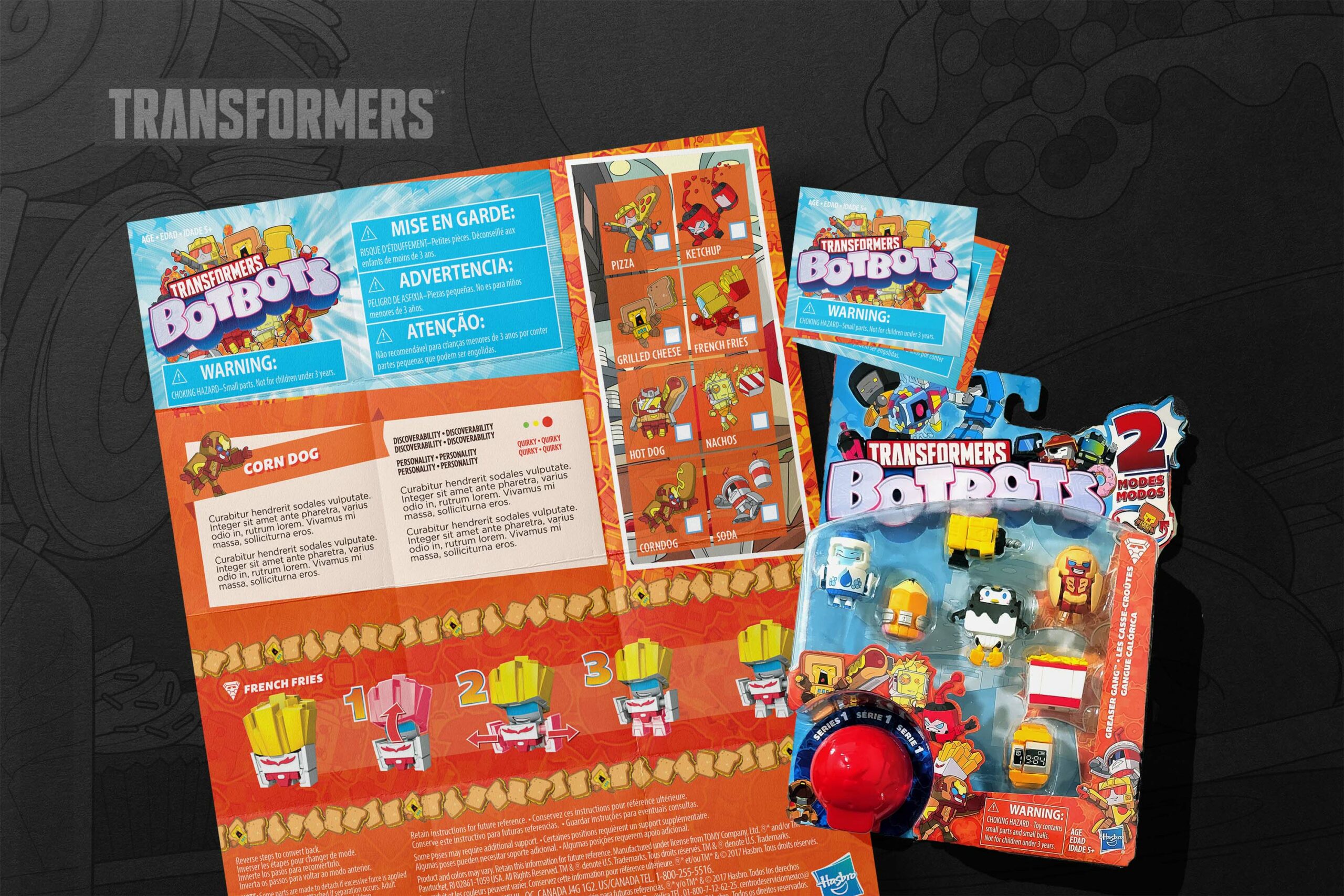
Botbots

BotBots prototype instruction set was most challenging due to its strict requirements. The same instruction dimensions had to be utilized across the entire lineup of BotBots products. From a single BotBot, through a 7-pack the same instruction size had to be packed away and fit within the packaging. The backside also featured a custom illustration cross sell for the other products.
This project required extensive coordination with the packaging engineers to get the most optimum size to keep the costs down while fitting everything needed on the sheet across the full lineup.
